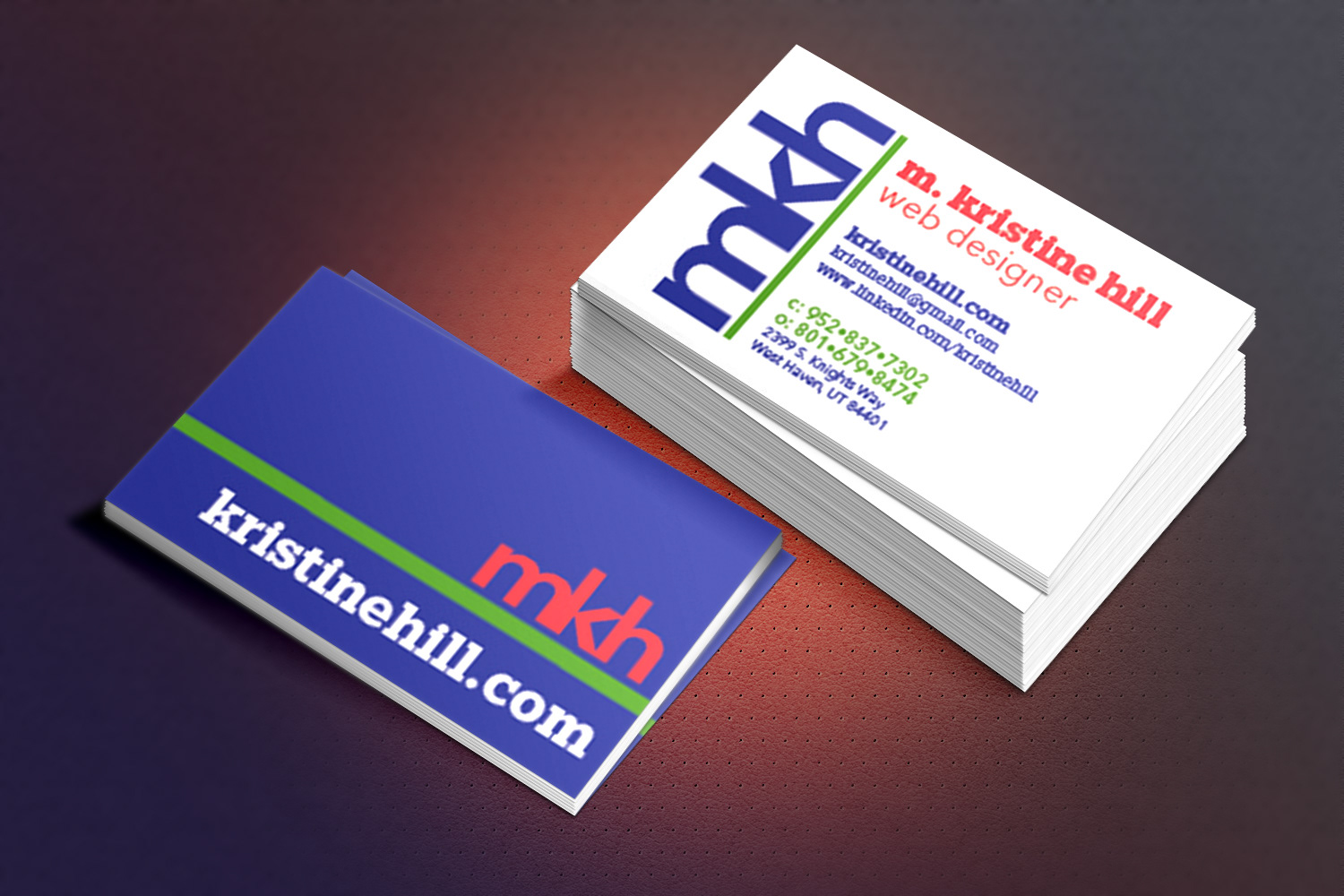
Type-based business card design. Front and back views.
Using only type, color, and font to design an effective business card presents a challenge. A logo-type using my own initials provides a memorable, recognizable image. Hierarchy was created through variations in the font, weight, color, and position.
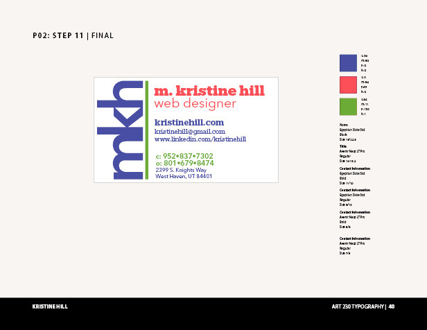
Style Guide: All spot colors are Pantone+ Solid Uncoated
Starting with pencil sketched thumbnails, I developed this design through many versions. The digital sketches, variations, and final designs were created with Adobe Illustrator, then placed into InDesign for presentation. The mockup was made in Photoshop with a file from graphicsfuel.com.
Using red to draw the eye to my name, three colors help create visual flow for the reader. Bold makes the web address prominent, suggesting that it is the preferred next step for the interested reader. Green differentiates the phone numbers in a smaller bold font to make them easy to find. Other contact info is kept smaller, lighter, and in the least prominent color giving it a low level on the hierarchy.
Keeping all the type flush left on the front, and flush right on the back balances the design, as does the white background on front, and solid blue on the back.
Turning the logo-type on edge adds a little variation and punch to the card. Back on its base on the reverse, the logo-type heads up the top-priority information: recognizable brand, and website address.