Book cover mockup "Like Water for Chocolate" by Laura Esquivel
The book cover project assignment was to begin by taking photos of an ordinary object. I started with a goblet of water. Next, we were to combine that image with another object or element to create a concept. I added chocolate in place of the water. The title of the book was to be chosen from this concept. This book title had been floating around in my mind as I did my photo shoots, so it influenced my decisions.
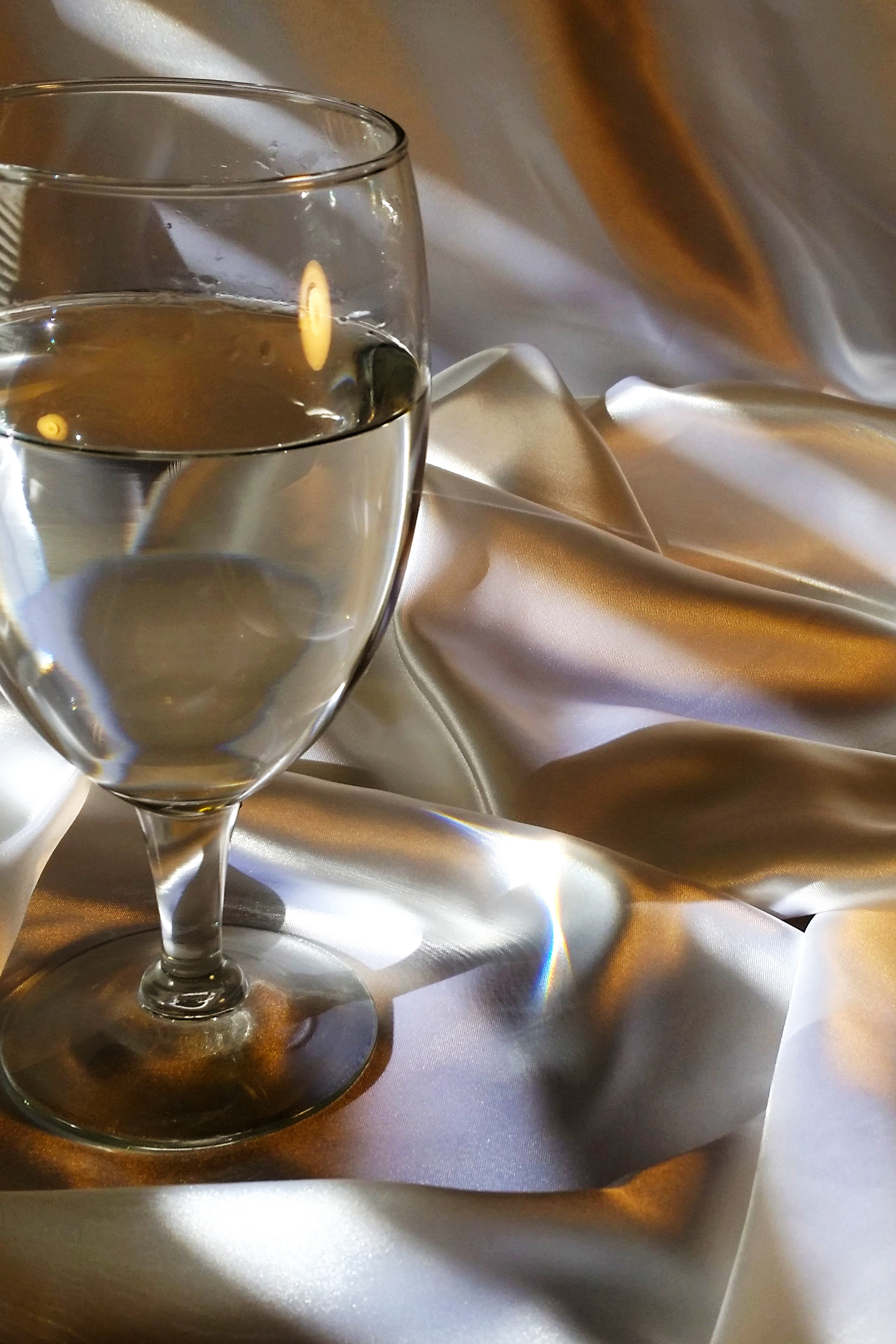
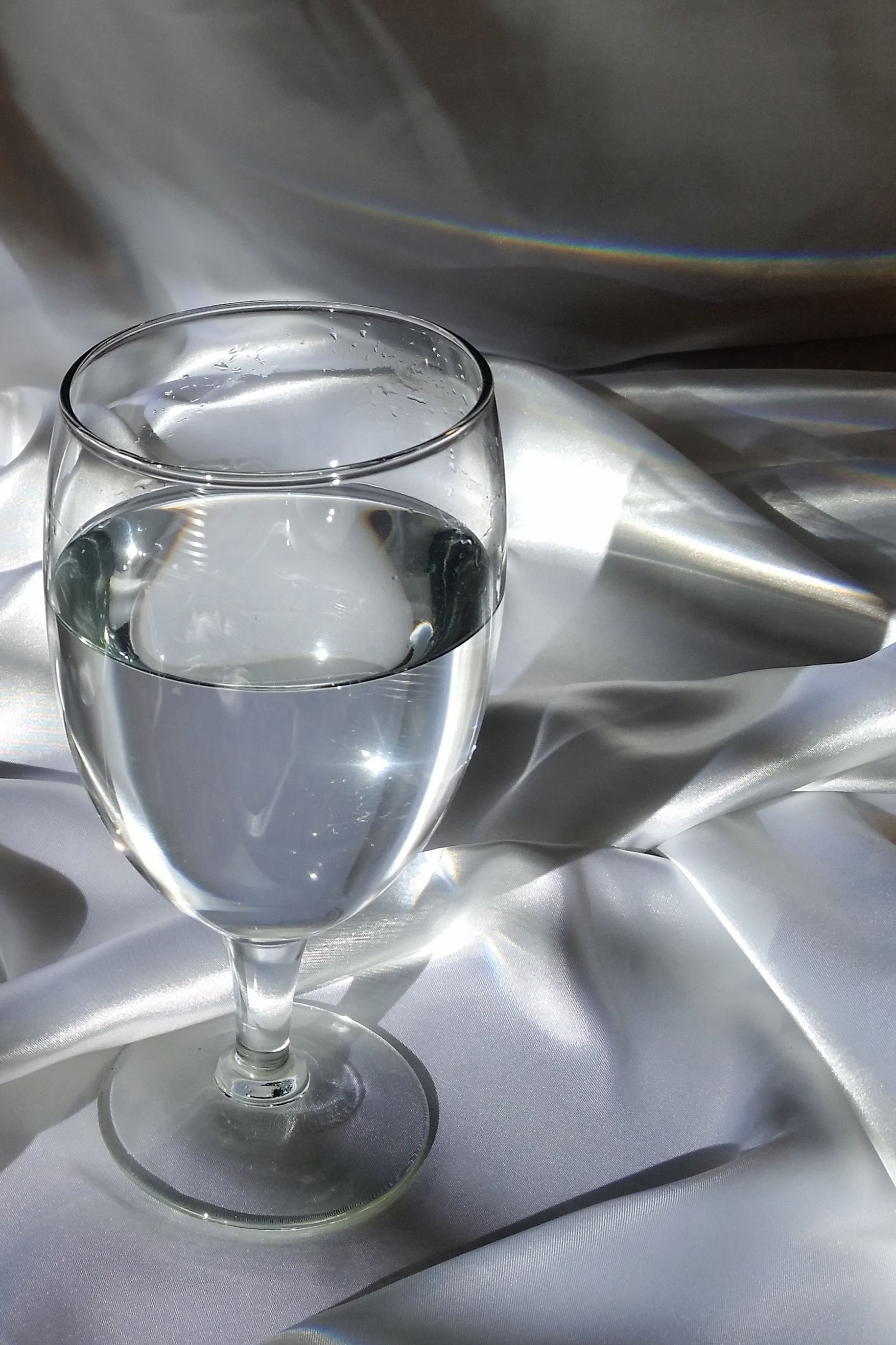
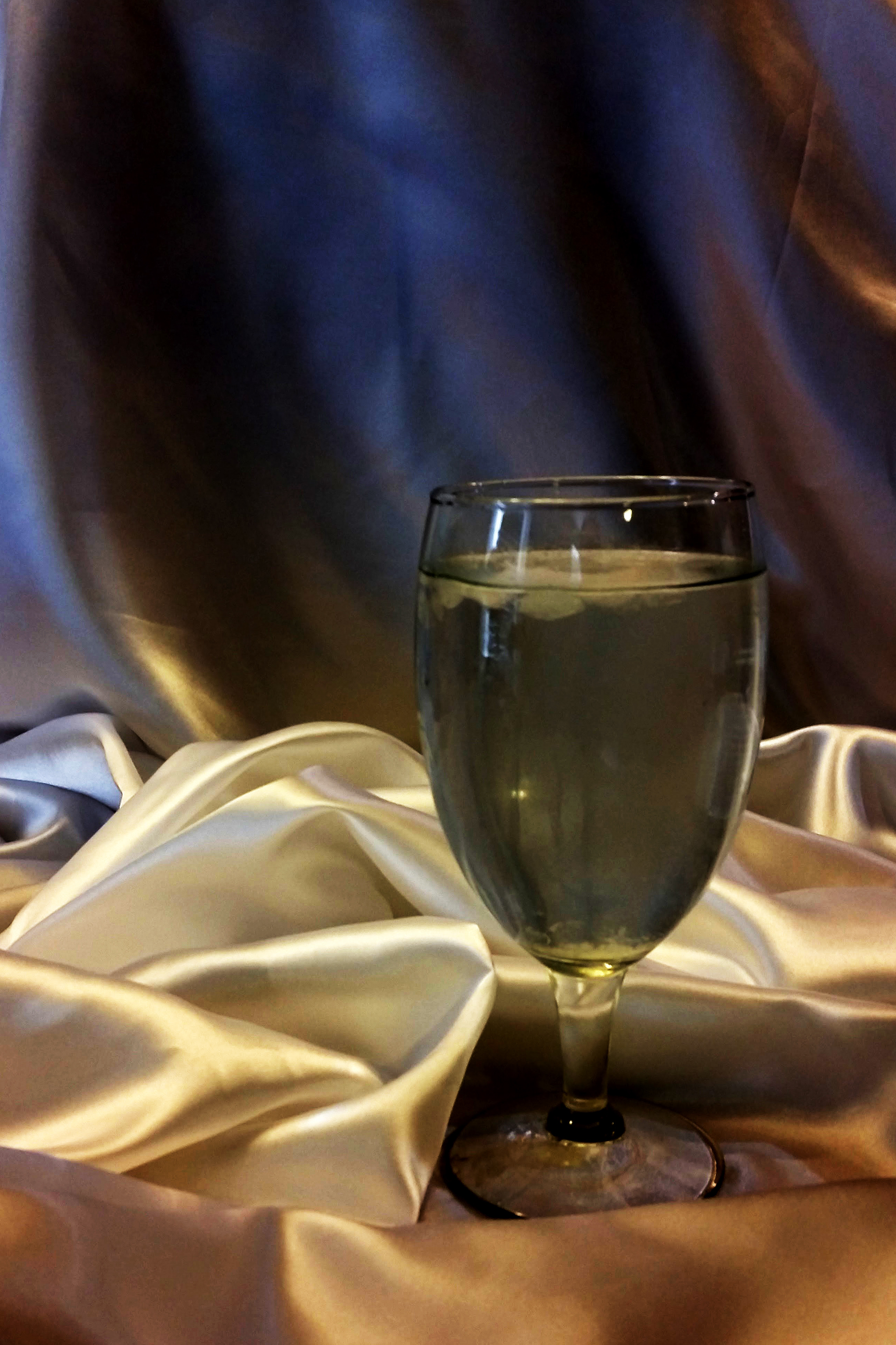
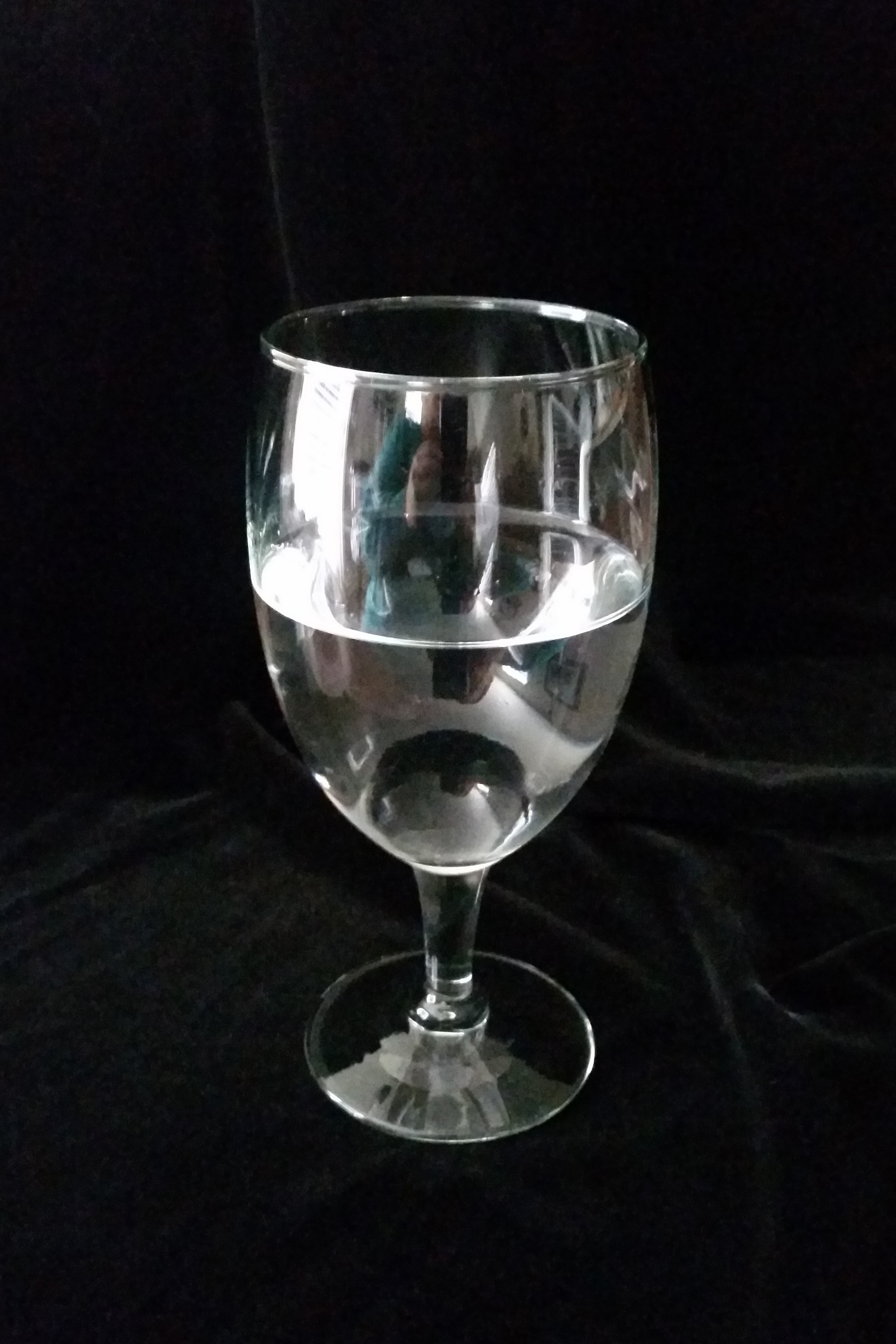
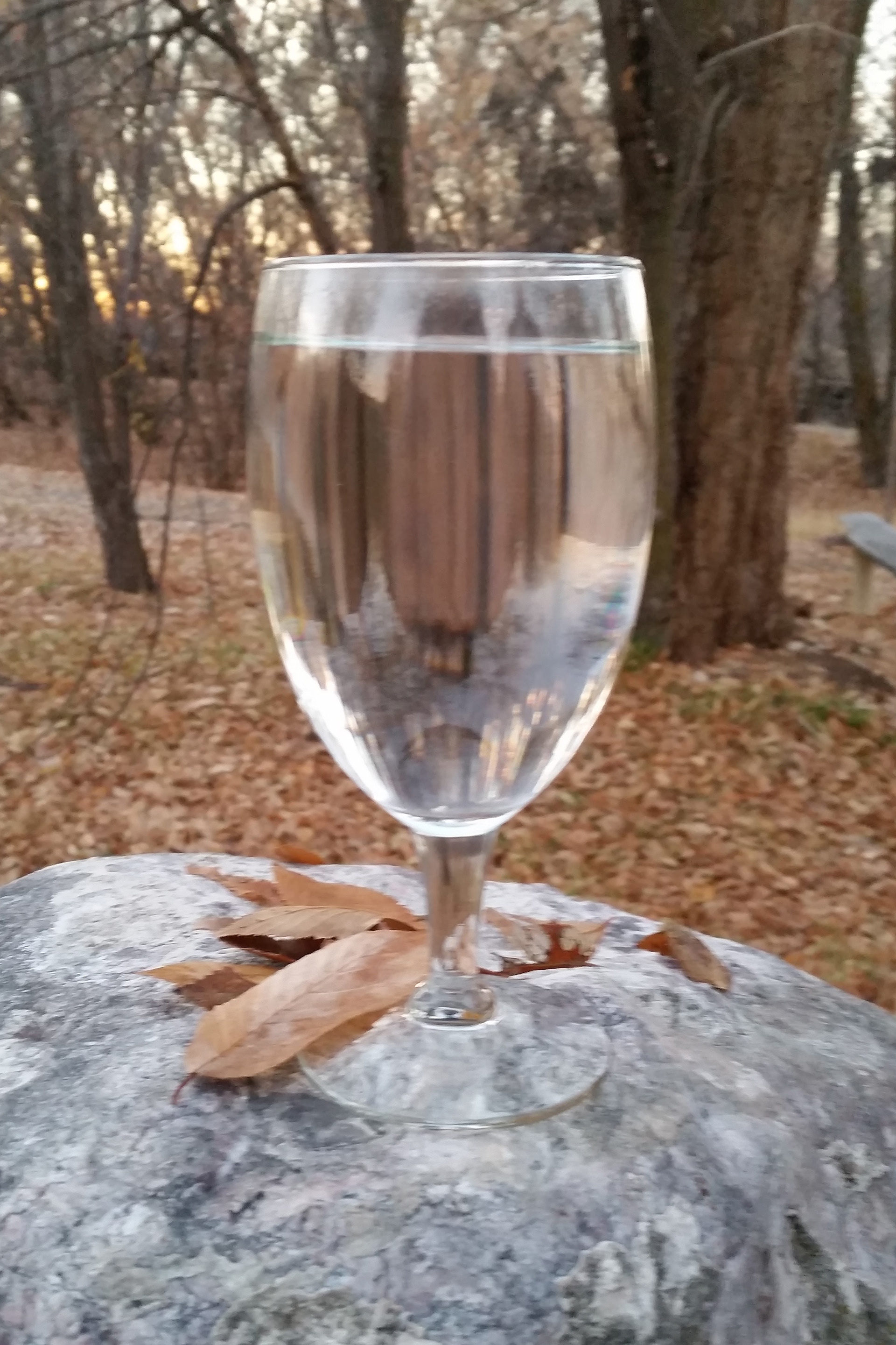
The first step in the process was taking these photos of a water goblet on white satin, black velvet, and outside on a boulder surrounded by fall leaves.
The next step was using chocolate in place of the water. I used a big hunk of dark chocolate, small chunks of chocolate, steamy hot cocoa, and liquid chocolate sauce. Not having any real photography training, I struggled to get good images without a lot of glare, especially in the lower light settings.
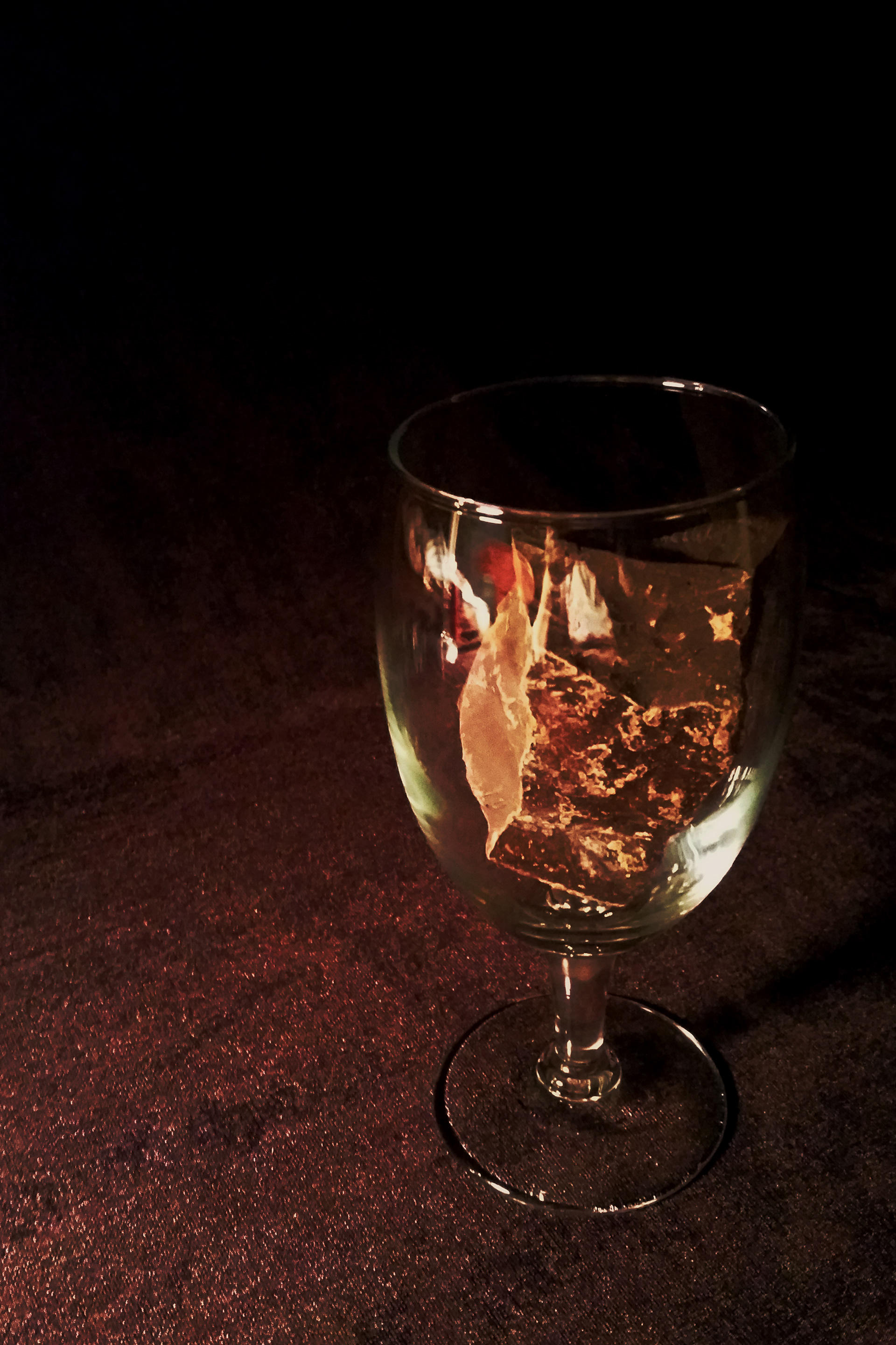
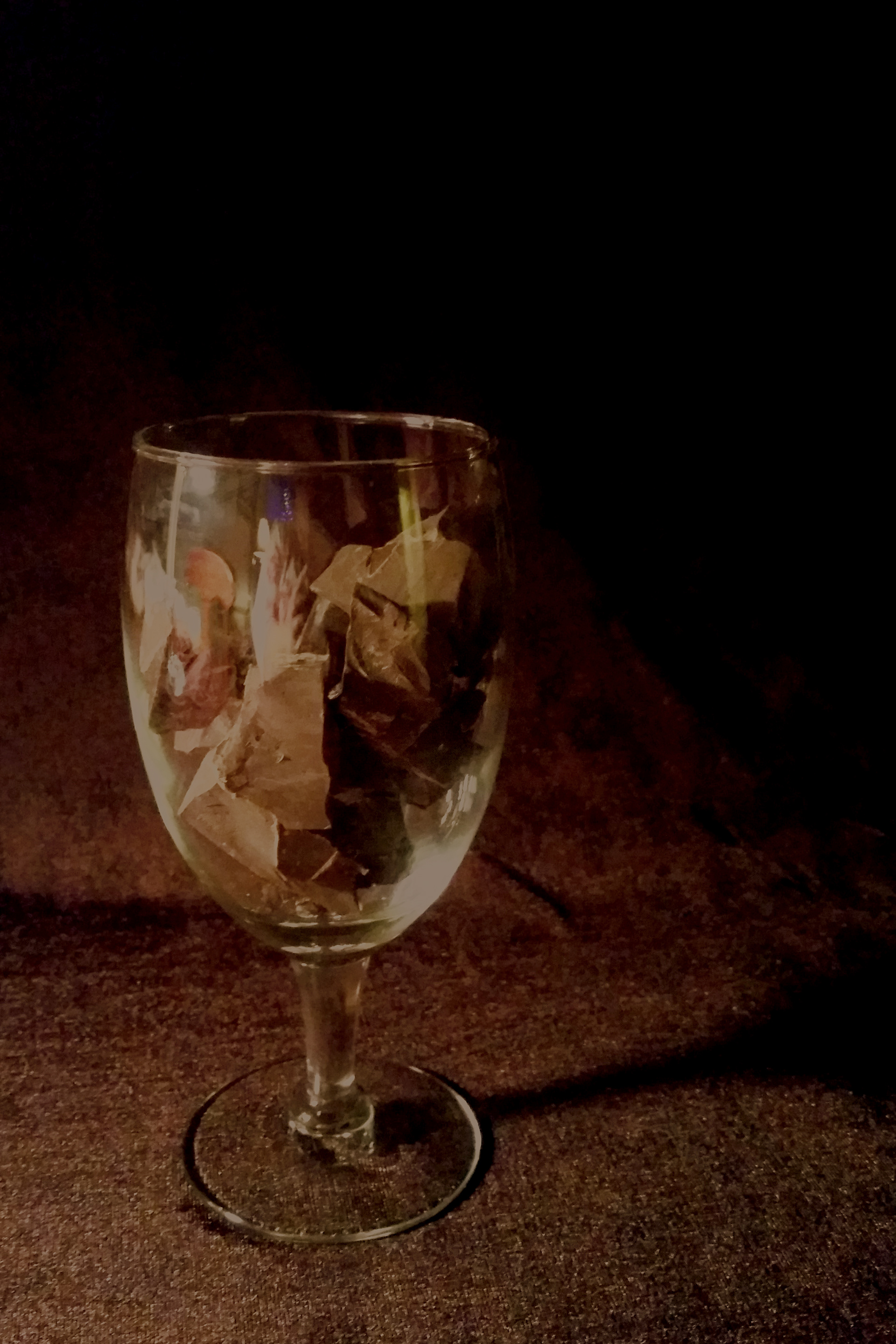
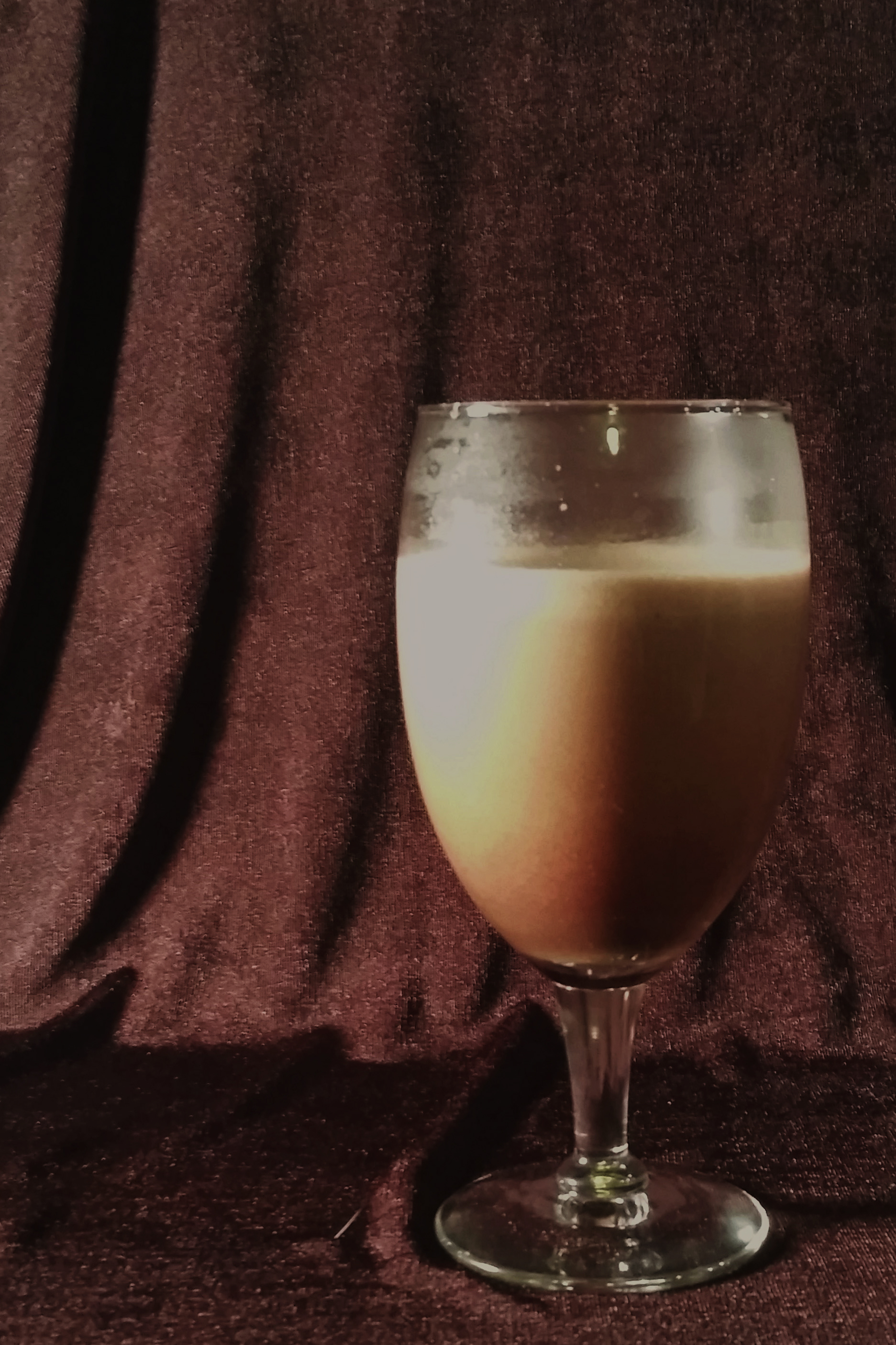
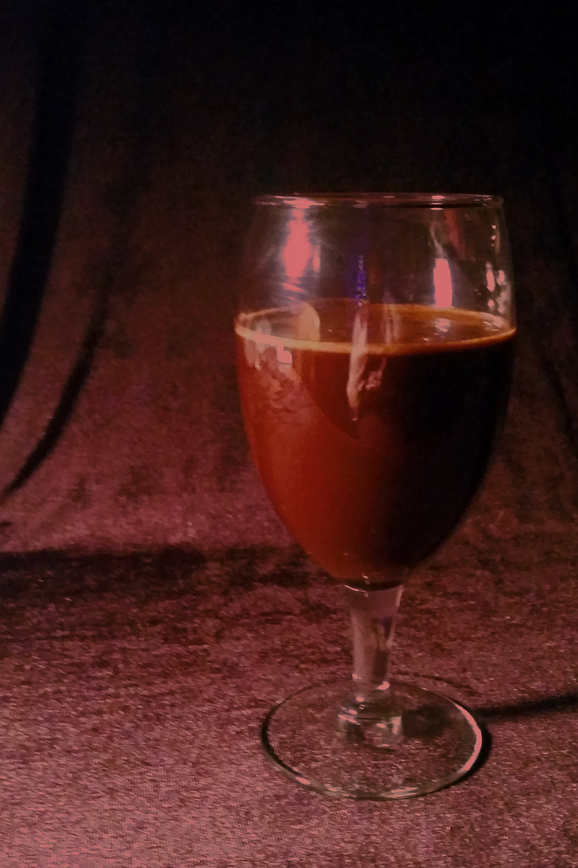
In a survey of these photos, most of the respondents had a hard time recognizing the contents of the glass. Many thought the first one was something burning, and the last one was dirty water. I learned that making the image recognizable to the viewer is really important to convey the correct message.
After the survey, I did a re-shoot using broken Hershey bars. The responses to these images showed much better comprehension. Next step, add title and author's name. I experimented with placement, alignment, different fonts, font colors, and one more creative alignment when I was trying to stretch my imagination.
To learn what a good book cover looks like, I studied award-winning cover designs online. I learned that the title of the book is usually as big as it can be, and frequently across the image. I also learned that traditional fonts are often better than decorative fonts. In the end, I chose version #9 from above. The title font is Baskerville, with the font color being taken from the shine of the glass in the image. The author's name is Arial, with the color being taken from a lighter part of the chocolate. The right alignment allows the type to fit around the image somewhat, while still overlapping the darker side of the glass. The word "chocolate" fits nicely between the bowl of the goblet and the foot.
To create a spine, I re-cropped the original image to include both sides of the goblet so it could wrap over the edge. I did some Photoshop work on the reflections, and extended the background. The book was published in English by Doubleday, so their logo is placed on the spine as well.
The book cover project was a great learning experience, combining photography, typography, layout, a other design skills. I really enjoyed this project!